SOCIAL SETTING
UCSD students are thrown into a life of independence, usually with not much financial support. Many students have never cooked in their life, but figuring it out is a vital skill for saving money and eating healthy. More often than not, cooking will happen in someone's home allowing for asynchronous and synchronous virtual interactions. Since the students attend the same college and thus live near each other, it is convenient and beneficial to cook in a co-located environment.
PROBLEM/OPPORTUNITY
This transition to college often has students longing for a way to combine the best of both worlds: the warmth of community dining and the satisfaction of a home-cooked meal. Many attempt to cook in their own spaces because of physical or social barriers that prevent them from sharing this experience with others, turning what could be a collaborative and enriching activity into a solitary one. For those who are navigating the kitchen for the first time, this isolation can amplify the challenge of cooking. WeCookt is designed to address this very gap, offering UCSD students a chance to not only enhance their cooking skills but also to forge connections with their peers through the universal language of food.
RESEARCH
Methods
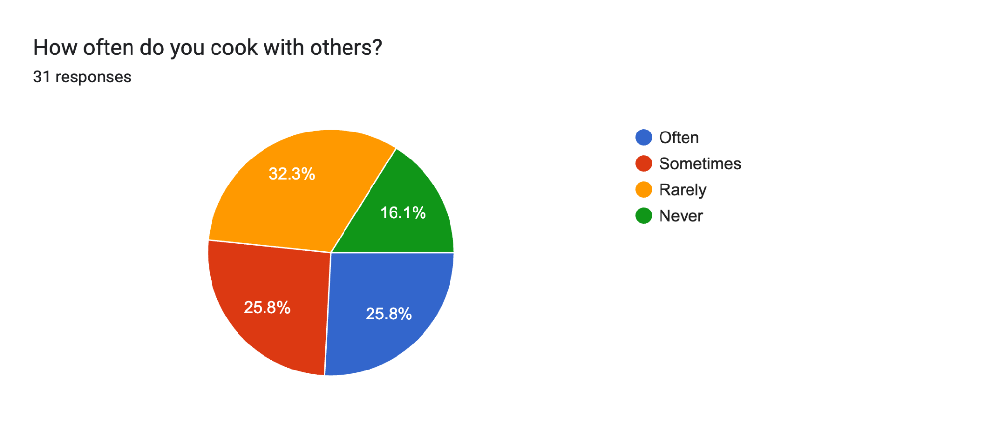
We surveyed a total of 31 college students regarding their cooking experiences and opinions. The survey included a series of questions aiming to understand their cooking habits, challenges, and the social aspects of cooking most important to them.
GOALS
Our main objective was to understand the experience of cooking as a student and how a social computing platform could alleviate these challenges and foster community through food.
FINDINGS
Our research highlighted a clear interest in recipe sharing and discovery with a significant number of students considering a community-driven recipe exchange feature to be quite useful. Such a feature reportedly would benefit their cooking experiences which underscores the importance of WeCookt to prioritize and improve this functionality. Additionally, the variety in usage of social media and cooking apps for discovering recipes indicated an opportunity to integrate this into a central platform tailored for student needs.
DESIGN PROCESS
OVERALL GOALS
Our team wanted to make WeCookt a platform where people of all cooking levels can use what they have at their disposal to learn and cook recipes in a fun, rewarding and collaborative manner.
USER JOURNEY
A typical scenario of someone who was looking to use the app to find recipes that they could make based on what they had in their pantry was the key scenario and journey that we created our user flow around. This gave us an idea of the main architecture of our app and pointed us in the direction of what features we should include.
PIGGYBACK PROTOTYPINg
For our initial ideas we decided to piggyback prototype off Discord to simulate the virtual interactions like finding a partner, as well as posts, comments, and building chatrooms.
FIRST PROTOTYPE
Prototype OverView
In our first prototyping session we wanted to display our main features of WeCookt which were personalized recipe recommendations curated by AI, hyperlocal chat rooms for a local ingredient exchange, a live virtual cook along and gamification of helping others. We used discord to simulate the virtual interactions and paper to simulate the process of cooking and the exchange of ingredients.
view our prototype presentation hereResults
The live prototype demonstration went smoothly as we received positive feedback as the virtual cook alone was an interesting novel aspect with instructions that were easy for people to follow. The ingredient exchange went smoothly and the gamification of the demonstration (handing out candy) proved to motivate people to interact with others and support each other.
feedback
The feedback we received was helpful for our second prototype. Users found the virtual cook along feature to be novel and fun, and so they desired us to expand upon that further. They also wanted it to separate more from the crowd, asking for more novel aspects to the app. The final major notes were about making the app more community based, and catering to a specific group of people. The people we decided to choose with this remark were UCSD students, considering they are the ones who would need it most.
SECOND PROTOTYPE
prototype overview
Two weeks after our first prototype we were able to produce our second prototype and incorporate the feedback that we received from our first prototyping session. A main focus of this prototype was to expand upon the novel aspects of our app and cater towards a more specific target audience.
view our prototype presentation hereNEW FEATURES & improvements
This second prototype displayed several new features including receipt scanning to enter in ingredients, a pantry management system (alerting users of approaching expiration dates of items in the pantry), the ability to merge pantries with friends to collaborate, weekly cooking challenges and more localized communication channels to create tight knit communities.
RESULTS
Most users preferred our second prototype as opposed to our first. They enjoyed the synchronicity of the virtual cook along. They loved the novelty of the recipe scanner, pantry management, and pantry merge, noting that they appreciated the “exploration of the less popular space of pantry and food waste reduction”. They also were happy with the community-based aspects. However, they wished that everyone could participate (similar to our first iteration) instead of a select few.
takeaways
All of our novel features seemed to be well-received among the users. It was definitely a step-up from our first iteration, but we had neglected that having the whole class participate is what made our previous prototype so much more enjoyable.
FINAL DESIGN
The cooking experience
Users scan a receipt or enter in their ingredients to utilize the pantry management feature. Information such as expiration dates and nutritional facts can be managed. Then, find recipes based on what they have in their pantry.
Connecting with others
Users can socialize and connect with others by joining live chat rooms to connect with others or find help, or merging pantries with friends to cook curated recipes together.
Live virtual cook along
Users can then join a live virtual cook along to learn recipes with others with real time interactions with other learners or the cook along host themselves.
NEXT STEPS
To solve the problem of allowing all users to participate, we wanted to add the ability to lurk in other chat rooms. This would make it so that users can feel a part of the whole, even if they didn’t want to actively participate.
FINAL NOTE
In our final design, we combined all the feedback from previous weeks together into something that we are proud of. The app looks and feels good, and takes everything we learned into account. Live prototypes are something that none of us in the group had ever done before, but it was a fun experience, and it taught us a lot about how we can make our ideas tangible in order to receive feedback before going all in something that hasn’t been tested.


.gif)

.png)
.png)
.png)
.png)
.png)
.png)
.png)


.png)
.png)
.png)
.png)
.png)
.png)


.png)
.png)


.png)

.png)

